UI/UX, Rebranding
Startrail PORT
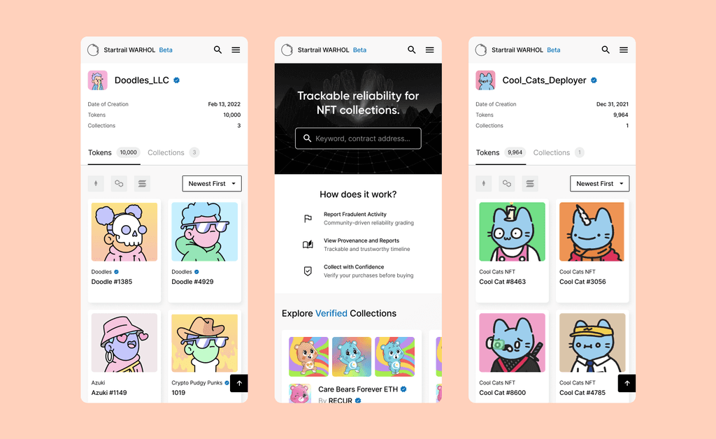
Startrail PORT is an all-in-one NFT dashboard that focuses both on physical artwork (painting, sculptures, etc.) and digital artwork (NFTs).
Role
Product Designer
Industry
Art, Blockchain, NFT
Region
Japan, America
Time
2022-2023
Problem
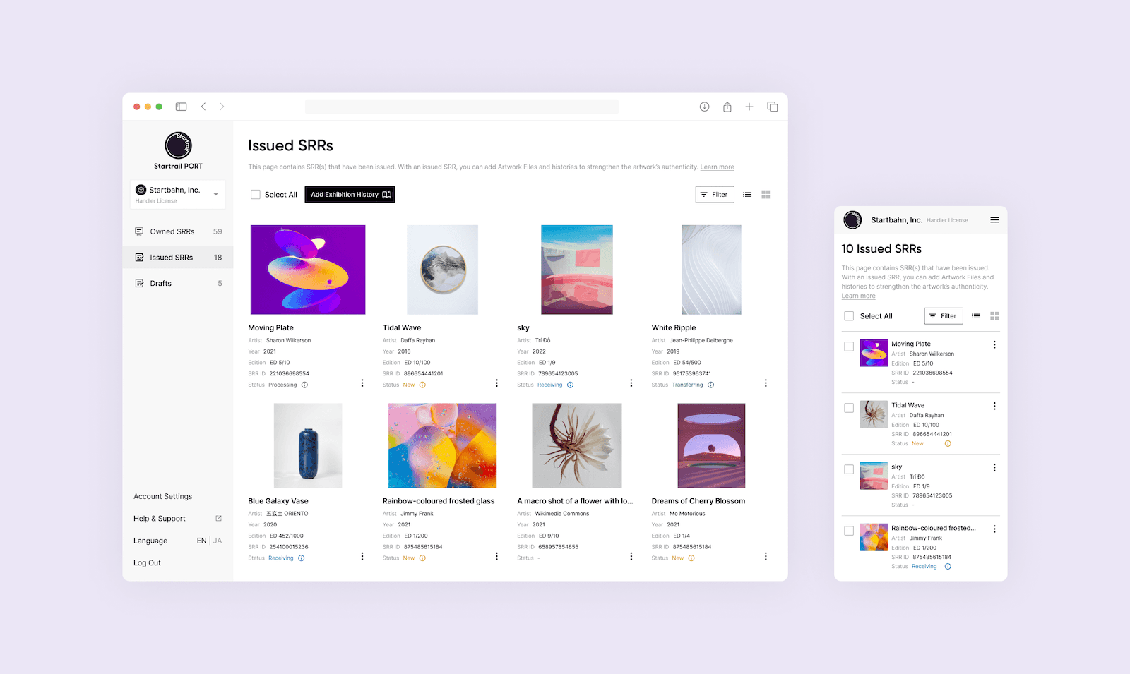
During the MVP phase, features were rapidly shipped out onto our service, resulting in a broken and frustrating user experience.

Old Dashboard UI
Internal Stakeholder Workshops
Identifying User Needs
User Journey Mapping
Before rebranding, when users created a new account, they were greeted with a completely white screen. The product was almost unusable for clients who weren’t guided by our customer service.
By identifying key pain points in the user journey, we aimed to improve the product usability.
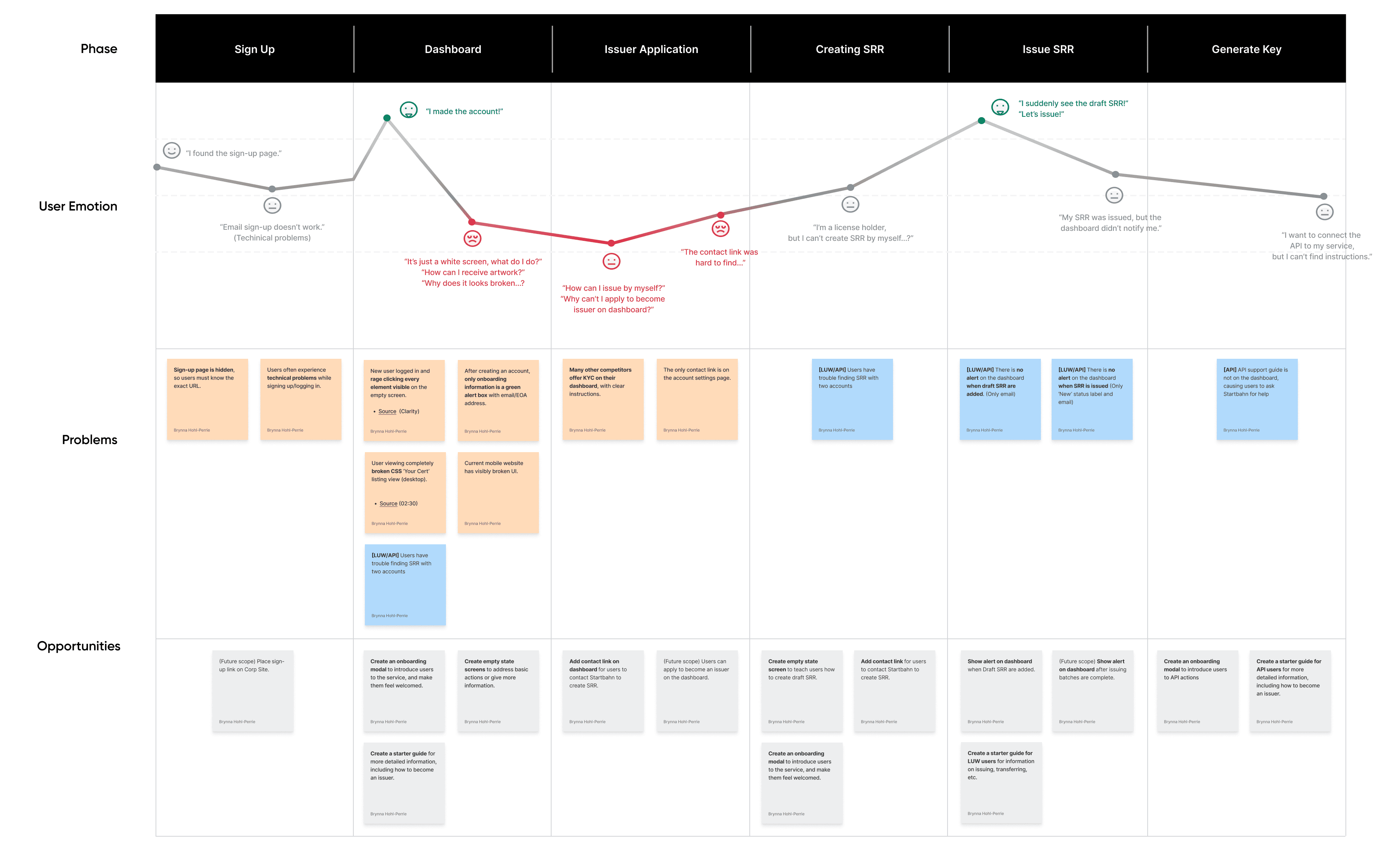
User Journey
Usability Improvements
Compiling the data we collected through user research, we made three key changes during the rebranding launch of our service.
Onboarding
During the MVP phase, the service had no onboarding or instructions; when users created an account, they were simply greeted with an empty white screen.
Users will now receive more guidance upon creating an account, including an onboarding modal, empty state screens, and additional information available via tooltips.
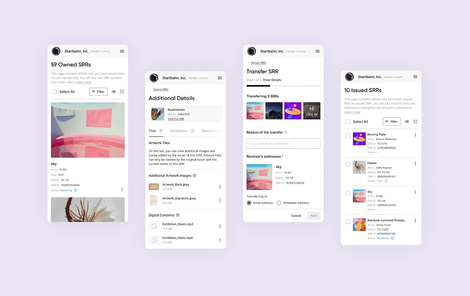
One Page for Artwork Details
In the original user flow, users had to click between 4 separate pages to see their artwork information.
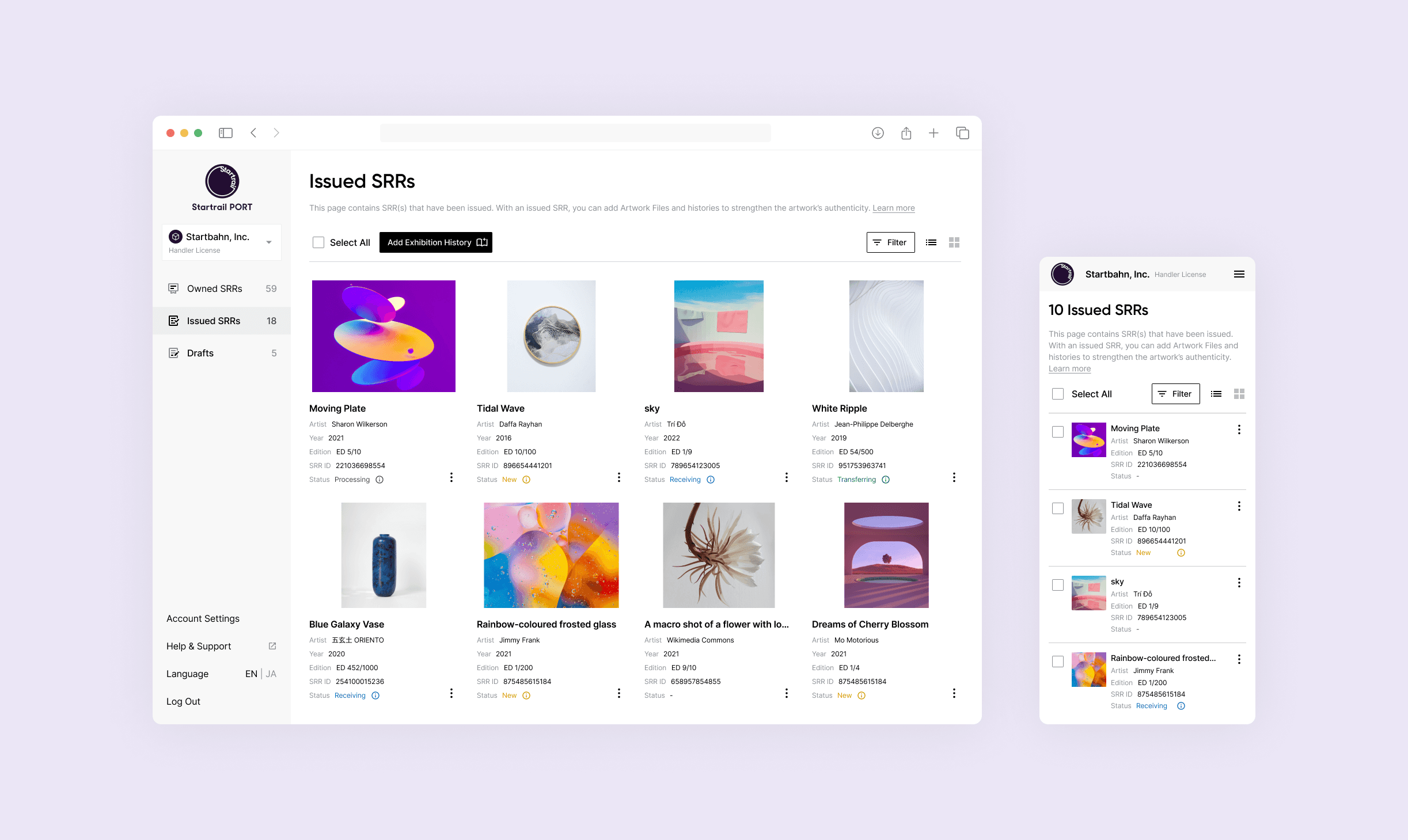
Now, all artwork details are available in 1 page. Users can easily navigate information about their NFT using tab navigation.
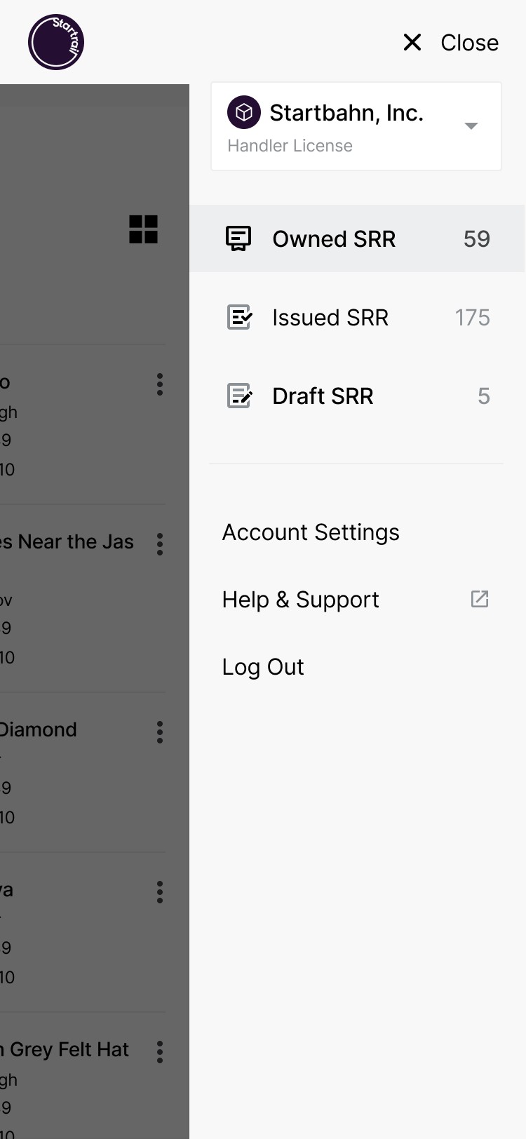
Easier Access to Drafts
In the previous user flow, users had to make 3 clicks to access their Draft NFT.
After the rebranding launch, users can find their drafts directly on the navigation bar, saving time for users who create NFT.
A New Visual Identity
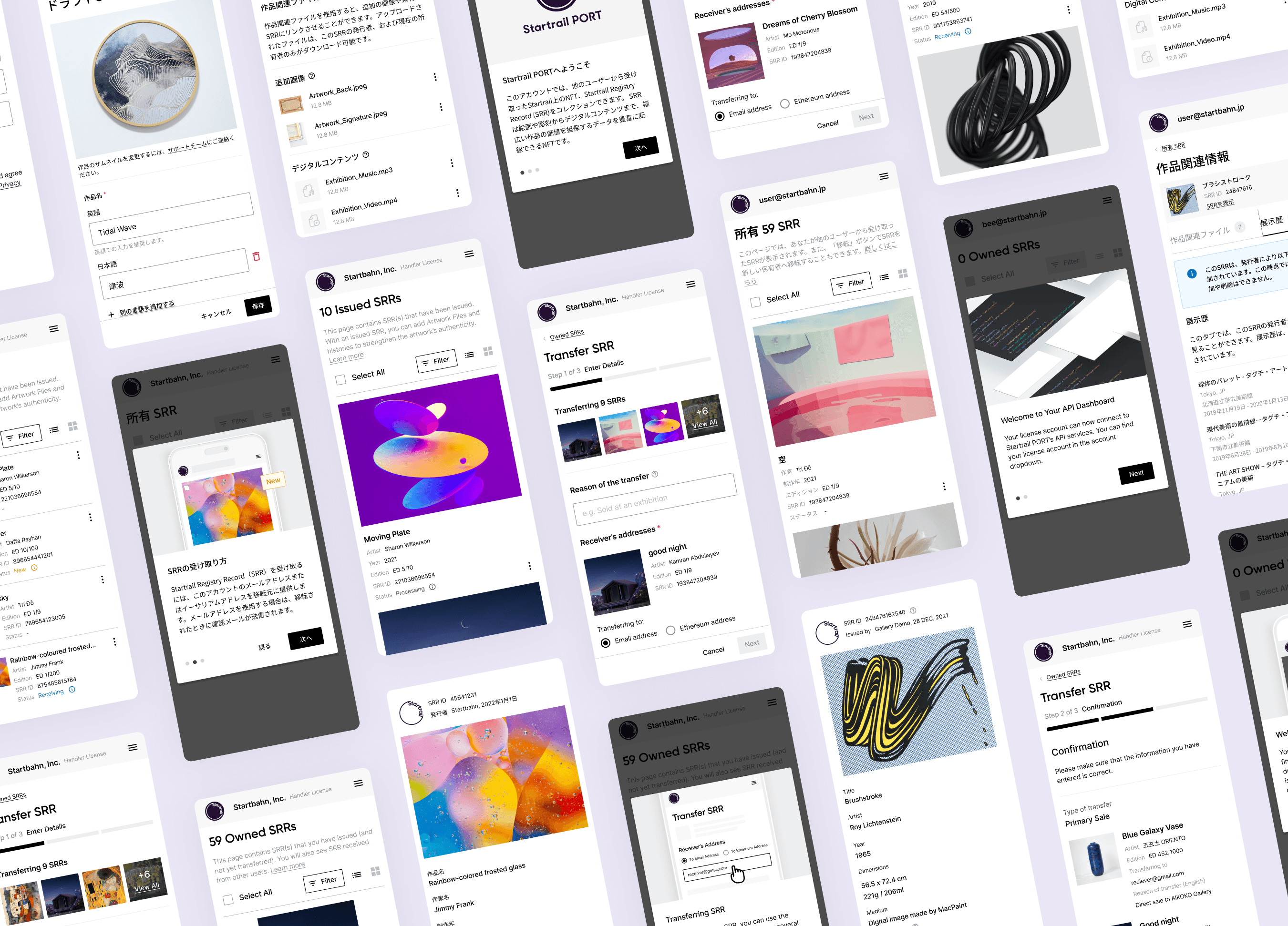
New Design System
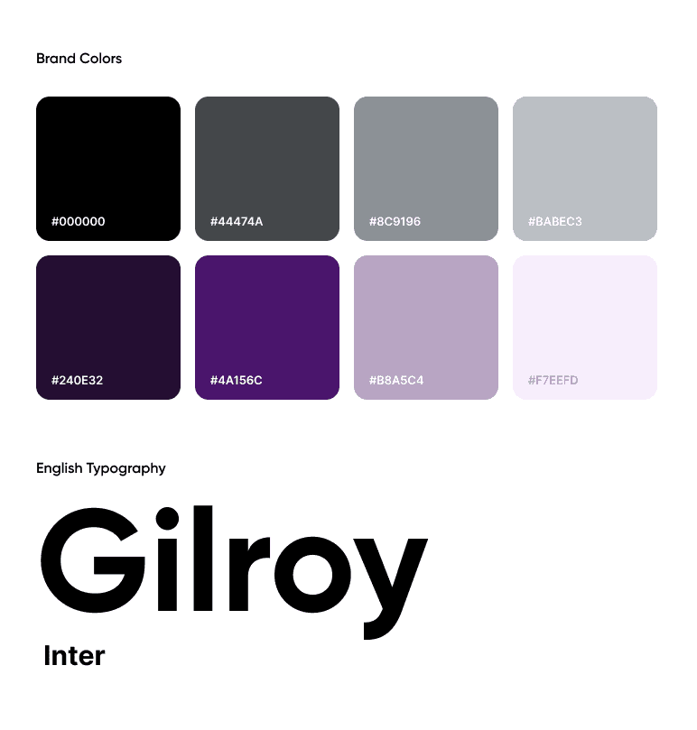
Our design team created a new Figma design system from scratch, creating new components, brand colors, and typography styles for this project.
We decided on a monochromatic black & white theme to bring emphasis to the user’s artwork collection, with a secondary purple color for interactions.

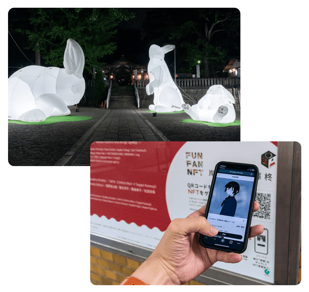
Community Engagement: NFT Scavenger Hunts
Conclusion
The rebranding of Startrail PORT was soft launched in 2023, with more pages being rolled out over the next few months.
The new design system we've built on Figma has improved productivity for both designers and developers, leading to smoother roll-outs and less time spent on UI review. In addition, when users were asked about the rebranding, we saw an 26% increase in customer satisfaction.
