UI/UX, Master's Thesis
LiveCare App
Helping patients receive the care they deserve, when they need it; at home, during a lunch break, or even after office hours.
LiveCare was designed as my master's thesis at Falmouth University, where I earned my MA in User Experience Design.
Role
Product Designer
Industry
Healthcare
Region
USA
Time
Feb 2023 - May 2023

Discovering Pain Points
User interviews were conducted with 7 participants, discussing their experiences in the American healthcare system. The main pain points shared by participants were:
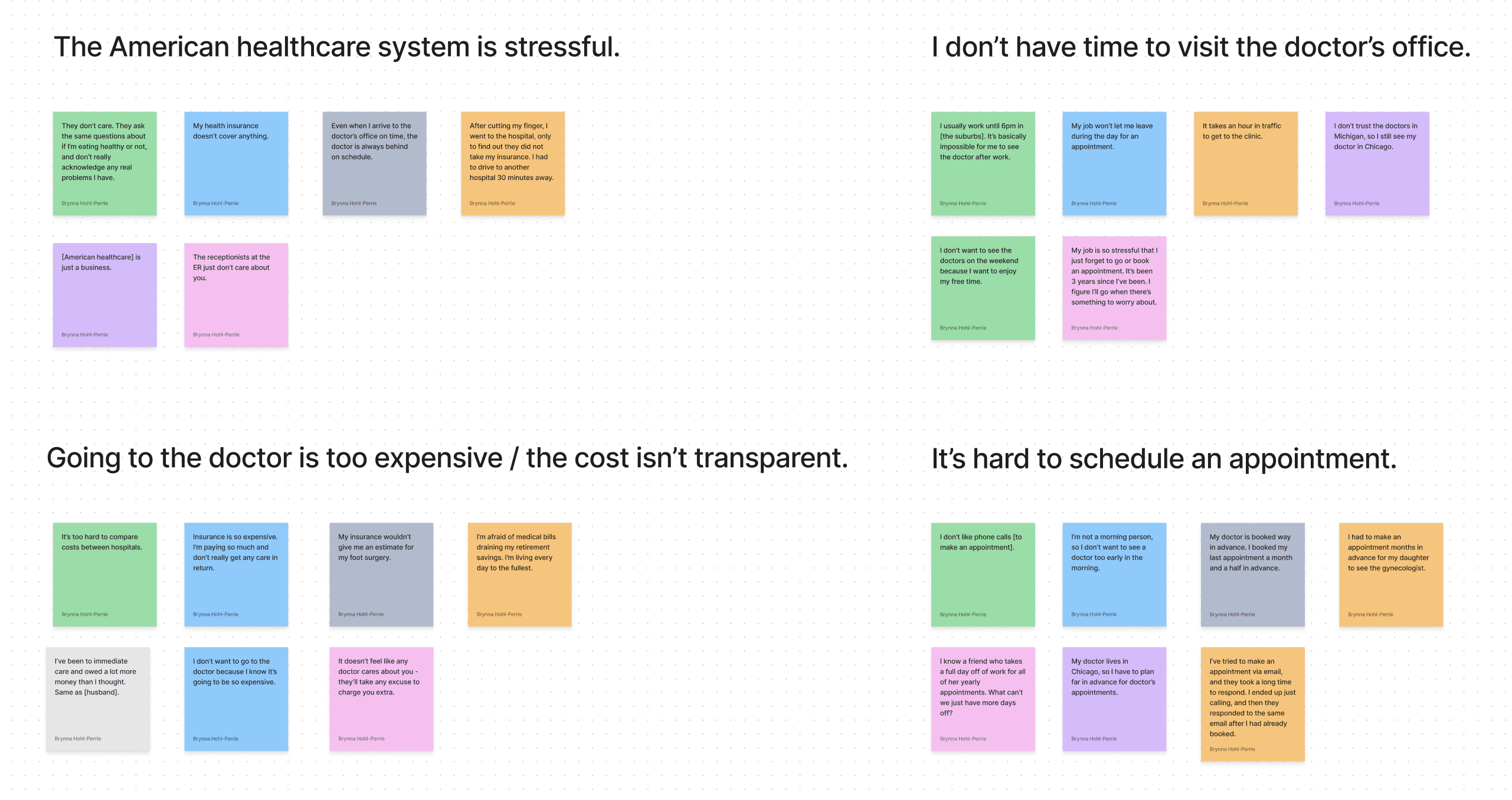
User Interview Affinity Map

Sprint Planning
Timeframe: 12 weeks
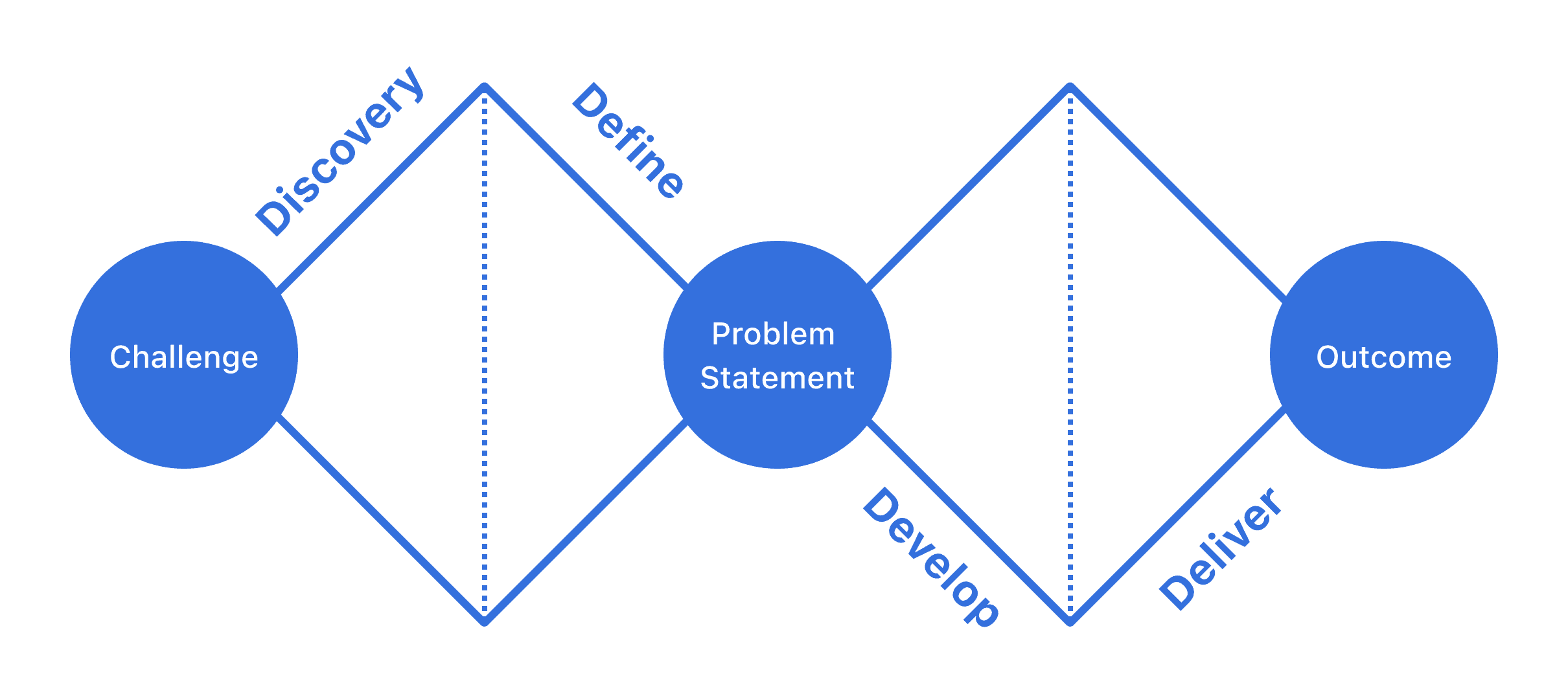
The double diamond method was used as the design framework for accomplishing this project. In addition, the project followed scrum management, being divided into 5 sprints across 12 weeks.
User Survey
A user survey with 85 participants collected information on their struggles and experiences in the American healthcare industry. In addition, users were asked what features they would like to see in a telehealth app.
Pain Points
41.7% of participants cannot take time off work to visit a doctor.
37.5% of participants find their doctor's office is too busy.
29.2% of participants find their clinic/hospital hours too inconvenient.
Needs
91.7% of participants want record of their diagnosis after their appointment
81% of participants want to find doctor in their insurance network.
75% of participants want notifications to remember their doctor's appointment.
Creating the Solution

Concentrating on solving key user problems, I started the design process by creating the ideal user flow: onboarding, profile creation, booking and attending an appointment, and actions available post-appointment.

Before moving to Figma, quick paper sketches were created of the home page, appointment page, doctor profile, and search page.
Low-Fidelity Prototype
Usability Testing
During usability testing, users were asked to complete the key actions required by the user journey.
Many users had trouble finding the 'Book Appointment' button. In the final prototype, the button remains sticky, and user choose a date and time after starting the booking process.
Before and After of the 'Book Appointment' button
User Journey
Onboarding
Users can learn about the app through three quick onboarding slides, and sign up for an account to begin receiving care.
Patient Profile Creation
Just like any doctor's office, patients are required to answer basic healthcare questions before they meet with a doctor.
Find a Doctor
On the home screen, users can see doctors available as soon as possible, easily search by specialist type, or find nearby hospitals and pharmacies.
From here, they can also access the search page, and find a doctor suited towards their needs.
Booking
In just a few basic steps, users can choose their desired appointment date and time, share their symptoms or concerns, and pay for their appointment.
Appointment
Users can attend a video call directly from the app - if they set up notifications, they will receive a notification five minutes before their call.
After their appointment, they can message their doctor with any additional questions using the in-app messaging system.
Medication Notifications
After being prescribed medication by their doctor, users can add notifications to remember their medication dosage.
Users can see how many days they've logged their medication, encouraging them to continue their consistency.
Conclusion
In conclusion, this project aims to transform the patient experience in the American healthcare system with a convenient telehealth app that is readily accessible on users’ phones. By addressing key pain points such as stress, time constraints, and scheduling difficulties, the design process prioritized the development of features that are both user-friendly and functional.
LiveCare aspires to empower patients to take control of their healthcare journey, making quality care more accessible than ever.


