UI/UX, Product Management
TakeMe
TakeMe is a restaurant booking platform targeted for travelers visiting Japan.
Joining in the early stages, I helped lead the launch of the MVP and key features.

Role
Lead Product Designer
Product Manager
Industry
Food Service
Travel & Hospitality
Region
Japan
Time
2023-2024
Problem
When I joined the company in 2023, user experience was not a priority; the sole business objective was to ‘book restaurants online’.
However, in a saturated market, we believed simply offering online restaurant bookings would not survive.
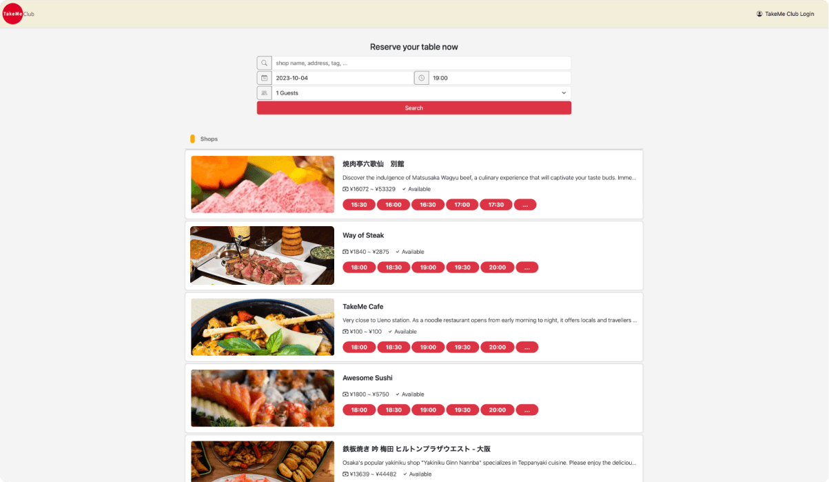
Original UI
Research and Discovery
With only three months before the planned launch, I worked together with internal team members to decide key use cases and features to target for the launch of our MVP.

Key Use Cases
Simply launching our service on Google wouldn’t generate traffic on its own.
After internal discussions, we decided to collaborate with hotels and influencers to create a strong initial impact for our launch.

Hotel Travelers
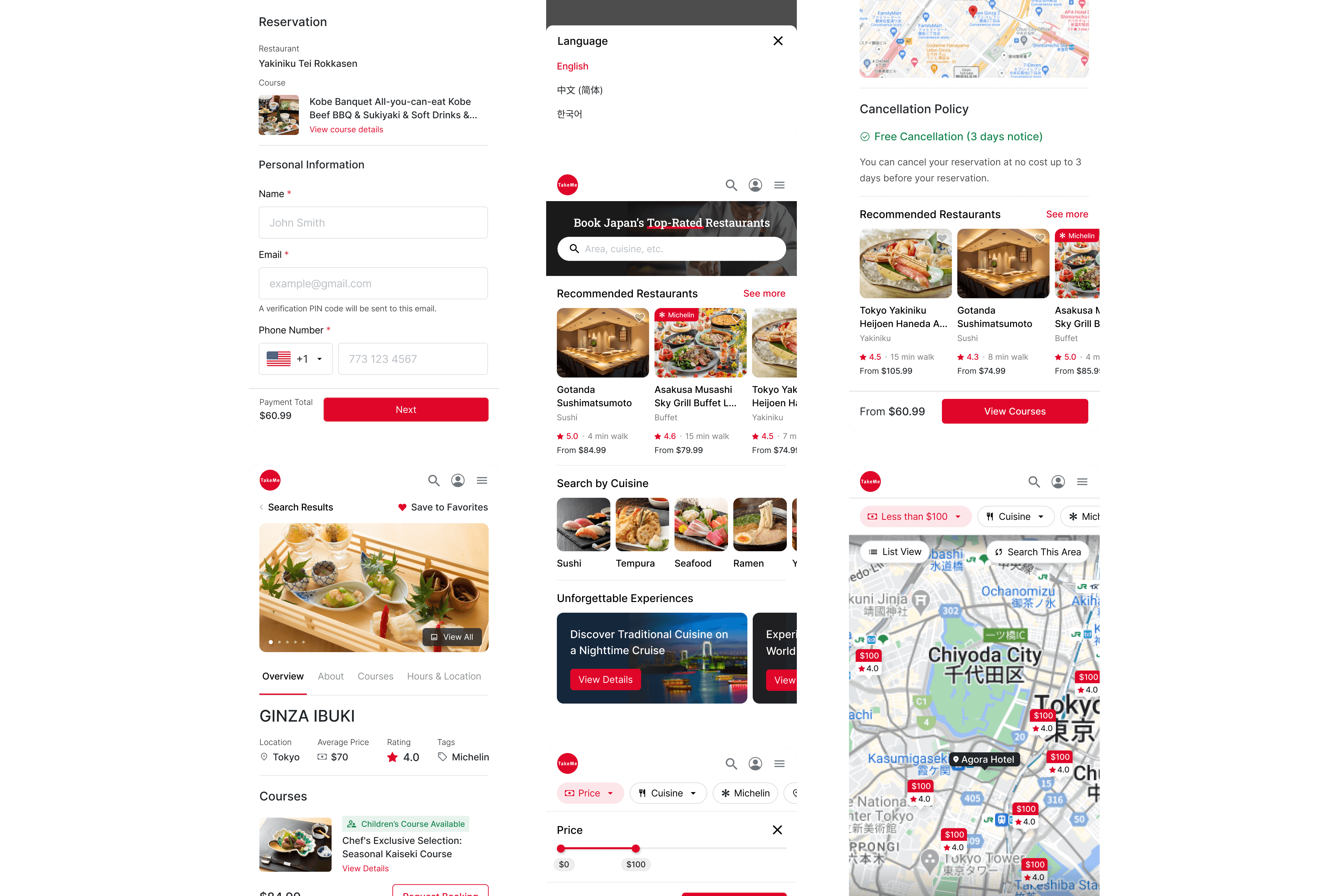
By accessing the TakeMe website via a hotel’s in-room flyers, hotel customers can see:
Hotel location pin on search page map
Estimated distance between restaurant and hotel
Instagram Foodies
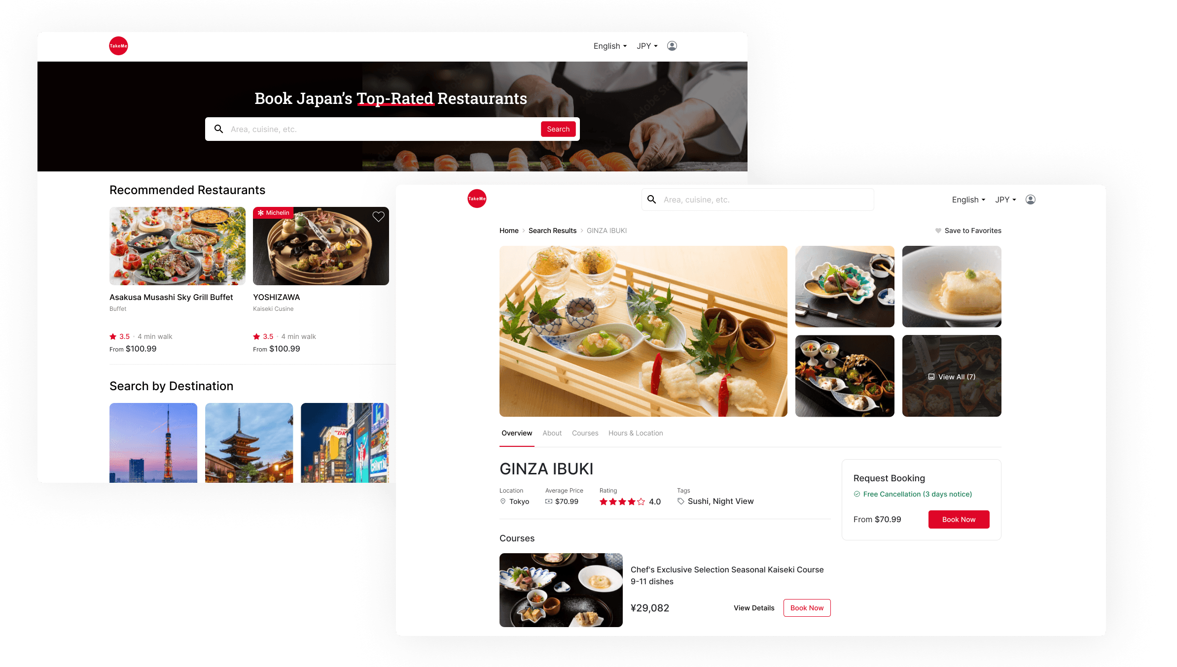
Through influencer marketing, users can discover our restaurants with affiliate links. Key features include:
Badges for Michelin-star restaurants
Direct booking links from Instagram, Google, etc.
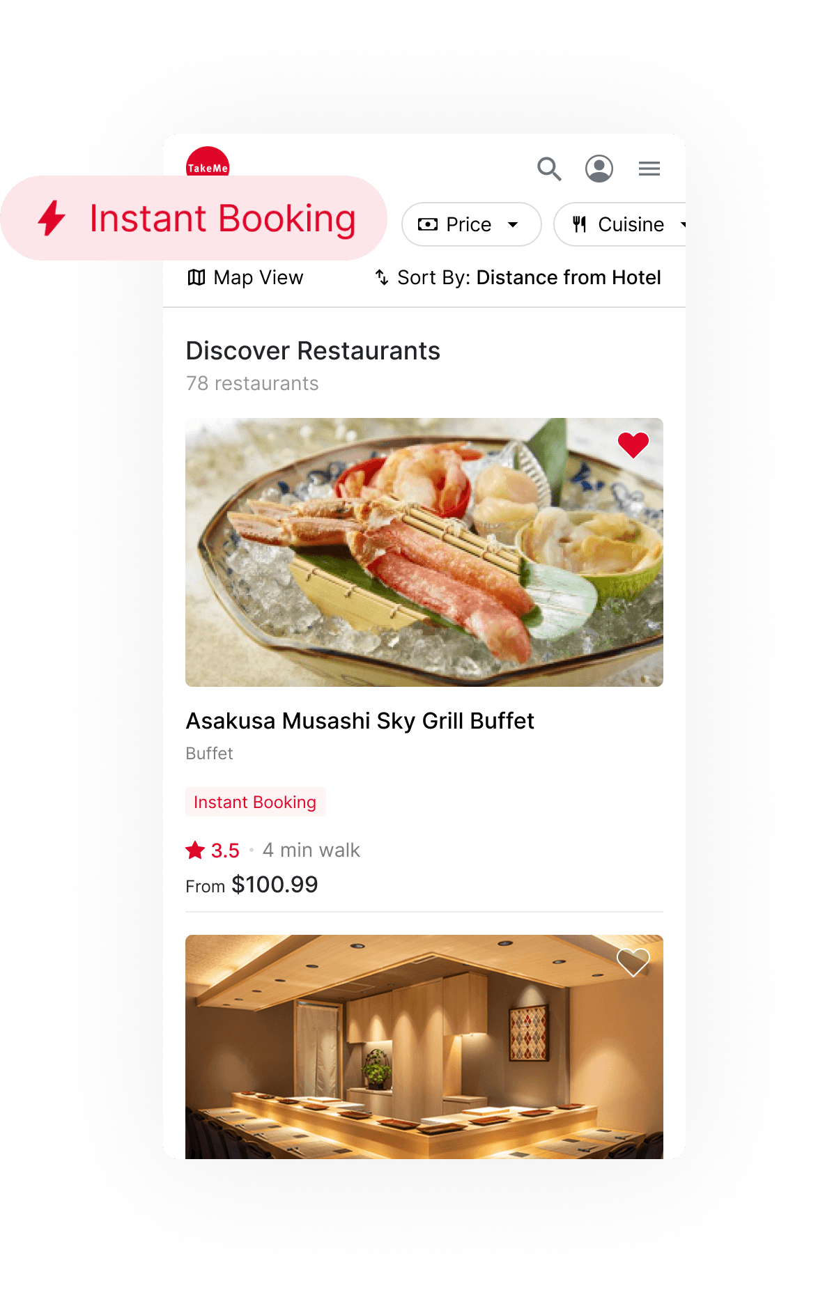
Instant Booking
In response to user research, we confirmed that users care for the speed and convenience of instant booking. Users can easily identify participating restaurants with UI badges and filter.

Conclusion
Starting from scratch only a year ago, the launch of the TakeMe product was successful due to identifying key use cases during the research and discovery phase.
We aim to further enhance our service by adopting a data-driven approach to improve user experience, ensuring that customers can find an unforgettable dining experience in Japan.
